Everything you need to know about Notion Charts - how to create native charts in Notion
Notion has recently released Charts. This allows you to create visualizations of your data on any Notion database if you are on a paid plan (users on a free plan get a maximum of 1 chart in their workspace). See more details about Notion pricing here.
Before Notion Charts, the only way to create data visualizations from your Notion databases would be to use a third-party tool. Here is a post explaining how that works.
Charts help you see your data as a whole for better insights. The type of charts you create depends on the data you have in Notion and the Key Performance Indicators (KPIs) you want to track. A good data structure (like database properties, types, and relationships) in your Notion workspace is crucial; making charts will be difficult without it.
Notion Charts plan availability
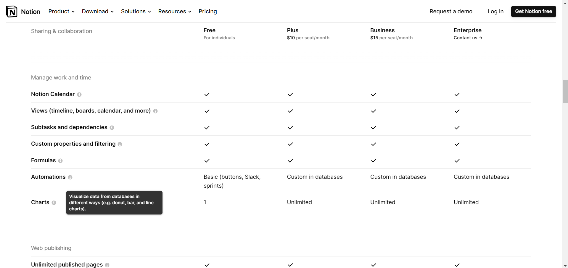
A screenshot of the Notion pricing plans including Charts availability
On free plans, Notion allows only 1 chart. Paid plans (Plus to Enterprise) can use unlimited charts. Duplicating a template with a chart while on a free plan counts toward your limit. If you’ve already used your 1-chart limit, you won't see the chart in the new template you duplicated.
How to use Notion Charts
Notion Charts are views in Notion databases. To create a Chart, add a database view by clicking the ‘+’ button next to view names, creating a new blank page with ‘Table’, or by typing ‘/linked view of database’ on any page.
Select 'Chart' as a layout option. Then, configure it to fit your needs. Here are the features to set up a Chart in Notion.
Chart type - select the type of visualization you would like.
X-axis - select which property you would like to show on the x-axis (horizontal), how you want to sort it, and whether to omit zero/empty values (i.e., the pages that don’t have the property populated).
Y-axis - select which property to show on the y-axis (vertical). Here, you can also do aggregations on properties of numeric type. Further, you can group by a specific property (e.g., grouping deal values by deal owner).
Style - select the color of the chart, set the chart height, value colors, data labels, and grids.
You can also export any Chart as PNG or SVG via the dedicated option ‘Save chart as…’
This ends the guide on using Notion Charts. How you use them will depend on your Notion setup and the data you keep in your databases. Here are some examples of how teams can use Notion Charts:
Incomplete tasks by assignee
Completed tasks by assignee
Overdue tasks by assignee
Percentage of tasks completed on time by assignee
Deals value by month closed
Deals value by quarter closed
Deals value by year closed
Total meetings per month
Total meetings per month by participant
Total meetings per quarter
Total meetings per year
Total deals created per week
Total deals created per month
Total product sales per week
Total product sales per month
…and many more, which will depend on what you want to track and how you determine success in your team efforts. This video by Ryan Deiss can help draw inspiration for metrics to track in your business.